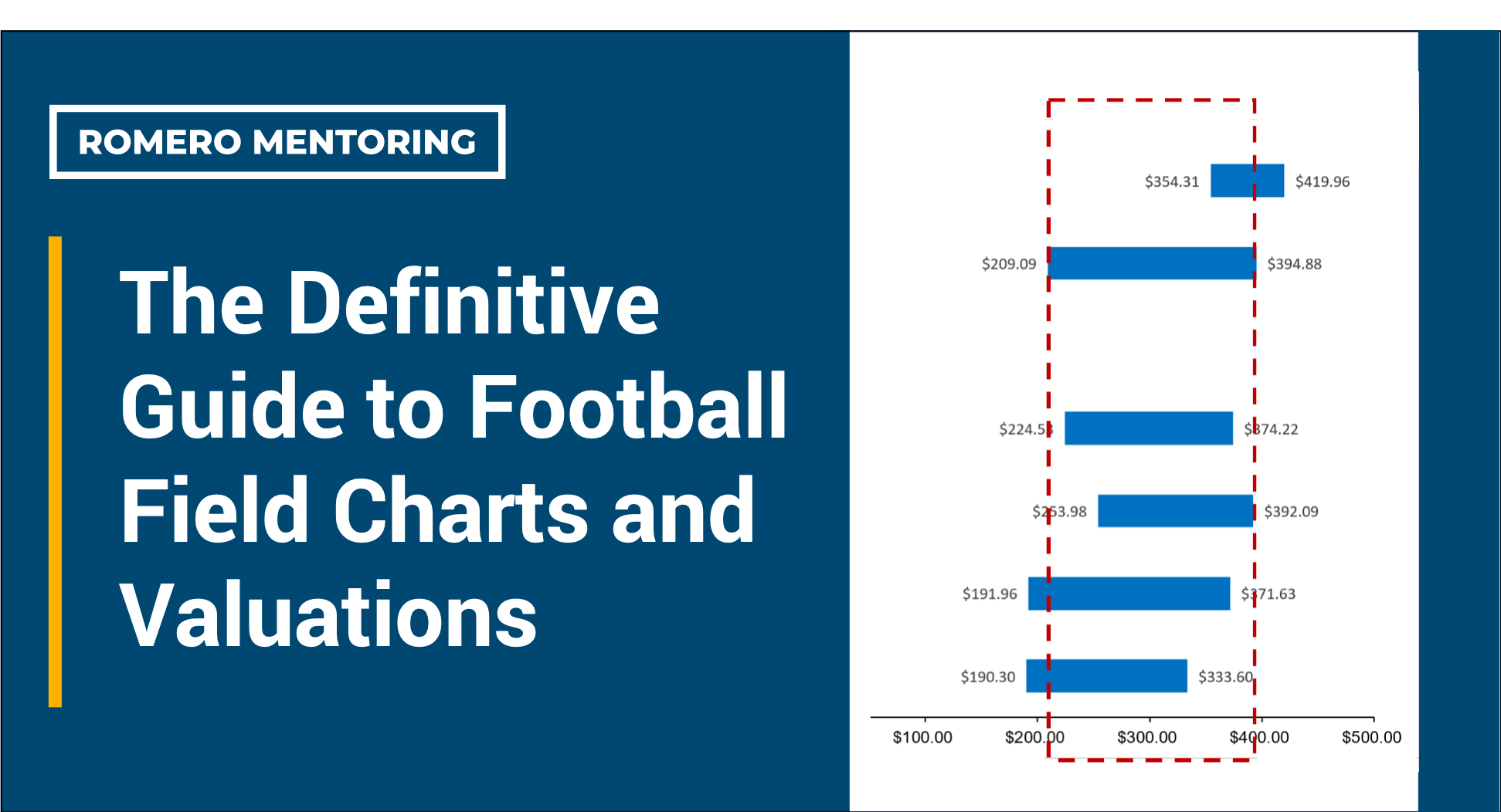
In any investment pitch book, numbers swarm the screen and it can easily become overwhelming. This is why it is beneficial to have a visual representation of the consolidated analyses and valuation. A football field chart is one of the most common ways through which analysts show the culmination of their financial statement modeling and valuation analysis. As the name suggests, the football field chart resembles the form of a football field in a stadium.
Just as how yard lines track the performance of a football team, the bars on a football field chart map out the stock’s performance. The dotted line is the stock’s line of scrimmage, and while the company could be tackled and lose yards, it could also launch a rallying drive that barrels towards the end zone.
What is a Football Field Chart?
The football field chart exhibits a company’s valuation range through the application of various valuation methods. To determine a company’s fair value range, we can apply several valuation methods like discounted cash flow analysis and comparable company analysis. These valuations are based upon forecasts of the company’s operational performance and financial means.
The football field also takes into consideration the company’s standing in comparison to competitors in the same market. Averaged multiples from other dominant players in the market, such as the Price/Earnings multiple, the EV/EBITDA multiple, and the Last Twelve Months’ Sales multiple give an estimate of the segment’s overall financial performance. Multiply that by the company’s reported numbers, and the stock’s future performance (as predicted by its own market) is revealed.
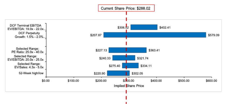
Both of these micro and macro perspectives are put up against the stock’s 52-week high/low range, and together, they provide a comprehensive overview of how the company has performed and where it is expected to head.
Tesla Valuation
However, there might be times when the company’s forecast seems like a whole Hail Mary away from the market comparables’ projection. One of the inductees in the automobile hall of fame is Tesla, whose visionary innovation and fierce ambition drove its financial performance and solidified its status as an inspiring growth story.
Despite the automobile industry suffering penalties to their overall performance in recent years, Tesla has managed to break away from the tackles and launch into a dominant run. In a football field chart representation of their stock performance, the ranges as derived from market comparables would sit far in the backfield while projections based on Tesla’s past performance and present financial means would be inches from the end zone. After all, Tesla does seem like the reigning Most Valuable Player of its burgeoning electric vehicle market at the moment.
In cases like this, it is imperative to use one’s judgment and evaluate if the company has the ability to keep up its commanding lead. Among others, factors like production capacity, ability to reap economies of scale, quality of customer service, and new product offerings from competitors are valuable to the evaluation. It is also prudent to note that in most cases, this discrepancy happens when the company is in the growth stage, as opposed to when the business has matured.
This is because it is at the growth phase that the company starts to maximize the utility of the infrastructure it has previously spent large amounts of capital on. There is also a focus on implementing operational systems and managerial practices that look to the company’s future rather than its present. These contribute to the company’s exponential growth, and hence its rallying stock performance.
How to Create a Football Field Chart
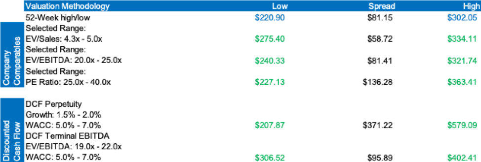
To create a football field chart in Excel, first create a table containing all the ranges of the stock price forecast, including both projections made using intra-company and market comparable valuation methods.
To ensure the accuracy of the numbers and congruence when projection multiples are modified, link the price ranges from the various sheets where the valuation was done. In the example below, the green numbers are individual projections linked from the respective valuation sheets, while the blue numbers are historical prices that can be found in Yahoo Finance.
In thinking about a final projected stock price range, one way to do so is to find the mean or median of all the estimated highs and lows. This will take into account many different factors that make up a financial forecast, hence providing a comprehensive picture of where this stock might be in the near future. Except for cases like the Tesla one explained above, the values should not have high variability.
To transform this price chart into the final football field chart, simply highlight the entire table and insert a “stacked bar chart” from the “Insert” tab in Excel. The stacked bar chart displays the different segments within an item (i.e. low, spread, high) and shows its comparison with other items.
There are different ways to format this chart, and one of which is shown in the first image above. The “low” and “high” segments are not represented in a bar, but rather, as values, for the spread bar alone is sufficient in representing all the data. This also creates a cleaner look, where the information is immediately apparent. To add more detail, it is also possible to include the current share price and the final projected price range as a superimposed dotted line and rectangle respectively.
Just as how a long drive builds up to the red zone, a detailed analysis culminates in a football field chart; and just as how performance in the red zone is vital to scoring a touchdown, it is important that the football field chart presents the information clearly and efficiently, so that the investment thesis is impactful and effective.
Romero Mentoring’s Analyst Prep Program

In just 15-weeks, you can become a world-class finance professional. The Romero Mentoring Analyst Prep Program is an all-inclusive internship, mentorship, and training experience like no other. Learn the in-depth principles of finance and apply what you learn through an extensive internship led by a finance professional with over 12 years of experience. Learn more here.
The Analyst Prep Program teaches the technical and practical skills that investment banks, hedge funds, and private equity & consulting firms look for in a candidate. Students begin with little to no technical skills and develop into fully prepared professionals who can perform as first-year analysts from day one.
About Romero Mentoring
Since 2016, Romero Mentoring investment banking training programs have been delivering career mentoring to job seekers, professionals, and college students pursuing careers in finance. We’ve helped over 400 students start their careers on Wall Street through our Analyst Prep and Associate Investment Banking Training Programs. Our graduates work at top-bulge bracket banks and consulting firms, including Goldman Sachs, JP Morgan, McKinsey, and many more.